

alternative vehicle showroom.
- Apr 4, 2018
- 4 min read

Background: As our society continues to grow and we begin to run out of space and resources to use, we must start looking else where in order to continue to live as we do. With this in mind our transportation methods will have to clean up their act, quite literally. These vehicles lack a place that they can properly be shown off to the world in all of their glory.
Site / Context / Program: The site that was chosen is one found in Carmel, IN, a suburb of Indianapolis, IN. The city of Carmel was chosen because of its rapid growth and economic wealth, this made it an ideal place for an alternative vehicle showroom, due to the people in the area being able to afford and maintain these newer vehicles.
Carmel as a city is one that likes to showoff where it has come and is slowly beginning to advance further. The center of town is being shaped to feel like a classic main street area, shoppes along both sides, walk-able, and house the citizens of the town.

The problem of Carmel lies within their design restrictions. The main roads in and out of town follow strict codes which does not allow for a lot of variation between buildings. Luckily the site is just outside of this historical zone and does not have to abide by the codes buildings 2 blocks north and east have to.
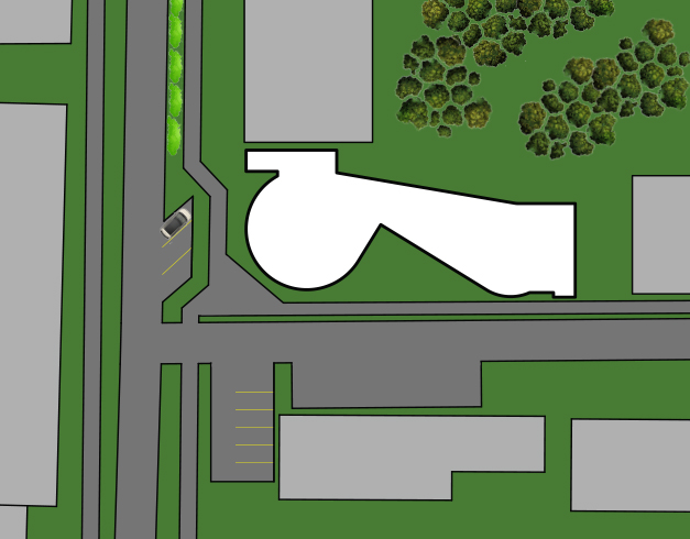
The site itself was a plot of land roughly 170' long and 70' wide, this site was extremely narrow which brought interesting challenges to the project and how to design around these issues. On top of this the front 20'- 25' were dedicated to continuing the street language which included parking right off the street.
The Context of the site included:
North: Currently an old home turned business, where this business is located it is sitting on very valuable land, so for our project we were told to reprogram it and put a new building on the site.
West: A brand new 5-story construction for Allied Systems and F.C. Tucker Realtors.
South: To the south is an exotics car dealership that specializes in buying and selling higher end imports and domestic vehicles.
East: Similar to the north, old house turned into an accountants office. Land is also valuable, so just like the north lot it was redeveloped as a new massing.
The Primary Program for the building required space for the following:
6-12 cars/SUVs/trucks
10-15 motorcycles/scooters
24 bicycles (8 types of 3 sizes)
On top of the required space for vehicles there were spaces for auxiliary spaces like, offices, maintenance/storage, mechanical room, restrooms, and secondary stairs.
Design Process: Originally looking at this the earliest concepts looked to Indianapolis and the International Speedway. One of the signature pieces of the track and its history is the pagoda which sits just shy of the start/finish line. The original concept was a derivation of that pagoda but almost immediately did the deign have flaws so this concept was scrapped.

The next attempt looked at breaking the monotony of Carmel with its rectilinear forms and lack of depth on the facades of the buildings. So in order to break that experimentation of curvilinear forms began. (see top image.)
But quickly, just like the pagoda, there were flaws in the design, primarily in how to place the auxiliary spaces that were not showroom floor (i.e offices, restrooms, elevators, etc.)
To solve this issue bookends were added to the north and east facades. These bookends served two primary focuses, one being able to "hide" the auxiliary spaces from the primary showroom area to keep it nice and neat. And it also helped create a transitional space between the rectilinear forms of past Carmel and the curvilinear form of this new showroom. (see bottom two images.)

From here the form began to take its final shape, the next step was to find a way to properly shade the south facade, this was done through fins that were spaced every three feet from the roof but this was only done to the second and third floors so that the exposure on the street level for the vehicle was maximized the visibility both in and out of the building. This was echoed on the north side of the building as well. These were spaced out by five feet instead because of the lack of exposure compared to the south side.
These shading devices do a good job at allowing in a marginal amount of sunlight in the winter to help heat the building but block out most if not all the sun during its most intense hours in the summer.
On the inside the program began to fit quite easily into the building in a very logical sense at that. The floors were broken into vehicle types, the first floor would hold the cars, second holding motorcycles and the third holding bicycles/electrical bikes. This order helped keep the weight of the higher floors down and helped alleviate the structure. From this basic form the building was broken down further, the breakdown can be seen below.


First Floor
Showroom for cars, SUVs, etc
Two offices
Maintenance area
Three means of egress to the floor
one main central stair
two fire stairs
Elevator large enough for vehicles
Main entrance
Second floor
Showroom for motorcycles/scooters
Two offices
Three means of egress to the floor
one main central stair
two fire stairs
Elevator large enough for vehicles
Two bathrooms
Third floor
Showroom for bicycles
Two offices
Three means of egress to the floor
one main central stair
two fire stairs
Elevator large enough for vehicles
Two bathrooms
Conclusion: Developing this kind of project had some considerable challenges, the primary ones being the small site and the lack of space to put the auxiliary spaces, but besides that the project was an enjoyable one and the final result was one that i am very pleased with the result of.
Something I would consider doing different if I were to redo this project would be finding a way to integrate the auxiliary spaces into the original form and push that further, I think this would have lead to an interesting design given the context of the site and what was trying to be accomplished.


Comments